Showing posts with label book design. Show all posts

Friday, August 23, 2019

Coming soon!

western fiction historical novel
Honest Westerns. Filled with Dishonest Characters

We've selected our book cover for No Peace. We chose this one out of a set of six prototypes. As you can see, the photo is watermarked, but I have since bought a use license. All that remains is the final art work. Getting close.


Monday, July 15, 2019


No Peace is one step closer to publication.

I have used the same editor for eleven books, and once again, I'm beholden to her for saving me embarrassment. I always think I've submitted a perfect manuscript, only to discover a prodigious amount of red ink on every page. Contrary to popular belief, novels are not entirely a solitary task. Beta readers, editors, book designers, and cover graphic designers all play a major part in bringing piece of fiction to market. I am grateful for them all.


Monday, October 28, 2013

I'm not one of them!

Some people are visual. I'm not one of them. But I appreciate good design, even if I'm incapable of drawing a straight line with a ruler. In school, I took drawing and drafting. I received a dubious C in both. (I did better in English and history.)

Writing and design come together in book covers. Every book, even an e-book needs a cover. And people really do judge a book by its cover. (See Judging a Book by its cover.) I'm always interested in cover design because book covers are so key to book sales. Flavorwire has done a fun piece on 75 Vintage Dust Jackets of Classic Books. Here are a few examples that struck my untutored eye.

James D. Best

James D. Best


Not included in the Flavorwire article, but still one of my favorites.


Related Posts

Sunday, July 28, 2013

Steve Dancy in New Jersey? What's that about?

film by Thomas Edison
Still from The Great Train Robbery

The Return, A Steve Dancy Tale partly takes place in New Jersey. Oh yeah, and Thomas Edison is a character in the latest story. Dancy fans need not worry; Steve has been firmly converted to an unabashed Westerner. He has good reason to visit New Jersey and it will take someone toughened by the Wild West to sort out the mess in Menlo Park.


Western gear
Serratelli Hat Company
New Jersey may not be the Wild West of the mid nineteenth century, but the Colt revolver was invented in New Jersey, Annie Oakley called New Jersey home, the Serratelli Hat Company is based in Newark, John B. Stetson came from New Jersey, and the first Western movie was filmed in New Jersey. Six shooters, western hats, and the birth of Western movies: that ought to be enough to give New Jersey a Western pedigree. Besides, Edison needs Steve and his friends to sort out a few problems or he may never complete his electrification of Wall Street.


Edison, has the curriculum vitae to play a role in a traditional Western, especially one where the protagonists are miners, not cowboys. Thomas Edison’s contributions to mining included new techniques in blasting, conveying, crushing, and magnetic separation. His greatest mining invention was the electric cap lamp. 

As for his cowboy credentials, he has none, but his company produced the very first Western feature film. In 1903, the Edison Manufacturing Company distributed The Great Train Robbery.


You might notice his name in the upper left hand corner of the title frame. I believe this makes Mr. Edison a cowboy at heart, which in my mind gives him the right to cavort in a Steve Dancy Tale.


Friday, July 26, 2013

These guys will kick your butt!

James D. Best
Bandits' Roost, Photograph by Jacob Riis, 1887


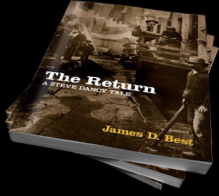
New York City gangs were notorious. This historic photograph appealed to me because in The Return, Dancy must defeat a street-gang to save himself and his friends. The feud starts in Leadville, Colorado and follows our hero east. I liked the photo so much, I suggested that it be used for the cover.

Final cover for The Return, A Steve Dancy Tale.


This is the full cover. I especially like the cowboy shadow the designer added.


The designers did a great job. As I mentioned in Get a Spine, the spine is crucially important because it is all a browser will probably see in a bookstore. Here are the six spines for the Steve Dancy Tales.


Do people judge a book by it's cover? Do book covers sell books? Yes and yes. Need evidence? Here you go.

You might also enjoy Vintage Photograph to Western Book Cover.

Monday, May 20, 2013

Books are such simple creatures


I’m currently going through the galley proof for The Return, A Steve Dancy Tale. In my supposedly perfect manuscript, I've already found over twenty revisions, errors, and typos. After these changes are incorporated into the text, the final step will be proofreading. Getting close.

The publishing process made me think that a book appears deceptively simple. Mental_floss recently published “10 Terms to Describe the Anatomy of a Book.” All of these words describe myriad parts of a book. Not such simple creatures after all.

steve dancy

Leaves
Endpapers
Edges
Wire lines and chain lines
Signatures
Manuscript
Head-piece
Half-title
Foxing
Diaper


Physical books are being shoved to the side by eBooks, so these terms will become increasingly important as books are collected for their aesthetic value. If you interested in the meaning of these terms, you can follow this link to mental_floss.

Wednesday, May 1, 2013

Get a Spine!


The spine is the most undervalued aspect of book design. This is especially true today, when so many indie-books only publish electronically. Writers are doing themselves a disservice by restricting the market for their books. Granted, the majority of my sales are eBooks, but I also sell a respectable number of print books. I do well with libraries, and despite not pursuing bookstores, I've found my novels carried in the big chains and independent stores. Additionally, some readers who prefer electronic books still look to see if there is a print version to strengthen their purchase decision. My recommendation is that authors insist on a printed version. 

If a print format is produced, then a book becomes a three-dimensional object and must have a back cover and spine. The spine is the most important.

Unless you’re a bestselling author, your books will not be stacked on tables at the front of the store, so only the spine will be seen when your book is on a shelf. The same is true for a library. If you want to sell your next book to a library, people must find and check-out your previous books. So pay attention to the spine. Getting sales is tough enough without your book disappearing in a maze of other books screaming for attention.

Tuesday, April 30, 2013

Judging a Book by Its Cover


Cooper Union
February, 27, 1860
The Shut Mouth Society is a contemporary thriller about a conspiracy that goes back to Abraham Lincoln. The novel was published in 2008, which happened to be the Lincoln Bicentennial. It opens with Lincoln's Copper Union address on February 27, 1860, prior to his nomination for president. On the same day, he had a photograph taken by Mathew Brady. (Lincoln claimed the Copper Union address and Brady photograph made him president.) A book cover that used this photograph would tie into both the novel's introduction and the Bicentennial. My designer came up with a unique close-up cropping that really showed Lincoln’s intelligence and determination. I thought it couldn’t miss.

Big miss. Sales were lackluster and customer reviews on Amazon and Goodreads were mediocre to scathing. Sales were hurt by an avalanche of nonfiction books released to take advantage of the bicentennial, and early buyers of The Shut Mouth Society assumed it was another book about Lincoln. A few even bought it because they assumed it was nonfiction. Although the story did include extensive Lincoln history, the novel was a modern-day chase thriller in which the protagonists desperately try to unravel a one hundred and fifty year old conspiracy.

I could have given up on the book, but The Shut Mouth Society was a finalist for Best Novel in the Glyph Awards, and it had received excellent reviews in the general press. We decided to try another cover design. You can see both of them side by side below. 

Abraham Lincoln
American Flag

The new cover worked miracles. Sales increased dramatically and customer reviews were effusive. At the time of this writing, the book has 161 Amazon reviews for 4.3 stars, and 491 ratings on Goodreads for 3.7 stars. I’m pleased with the Goodreads numbers because the newer rankings had to overcome dismal early returns. 

Nothing changed but the book cover.

Why am I bringing this up now? Because we’re in the final throe of designing a book cover for The Return, A Steve Dancy Tale. We had many concept mock-ups, but I rejected many of them because despite being nice graphically, they didn’t fit the story. I learned my lesson. Covers build reader expectations. This is why genre covers look alike. They’re designed to appeal to an audience that will appreciate the book. So don't believe the cliché that people should never judge a book by its cover. People do. 

Insist on a well-designed cover that fits your storyline.

Thursday, February 21, 2013

robertpeecher Reviews The Shopkeeper


Robert Peecher is a journalist and author of  the Jackson Speed Memoirs. He has posted a blog article about indie-publishing and included a review of The Shopkeeper. Peecher has said some very nice things about my book and I appreciate it. Here is a brief excerpt:


"The Shopkeeper is great on content. Best’s characters are well-developed, his plot is unique and engaging. At no time reading his book did it cross my mind that I was reading a book by an indie author. I found myself caught up in the story to the point that when I got to the last few chapters I abandoned all other plans for the day and just read until I finished the novel."


This link will take you to the full article.

Read some of his other postings. Peecher writes engaging articles with a generous dose of self-deprecating humor.


Saturday, February 9, 2013

The Evolution of a Novel


I just spent a week writing and surfing in San Diego. The writing went well, the surfing not so much. The weather was crappy for three days and I was crappy the other five. My mind tells me what to do, but by the time my body reacts, it’s too late. Surfing needs to be an unconscious reaction. When you think, you get cold water down the back of your wetsuit. Actually I had a few decent rides, but nothing to write home about.


Speaking of writing, The Return is in its final revision before professional editing. I start each day by revising what I wrote the prior day, so by the time I complete the manuscript I think of it as a second draft. Then I go through it one more time on my computer. I make revisions, but this third pass is primarily for continuity, clarity, and crispness. I've now completed this step for The Return, A Steve Dancy Tale.


My next step takes me to Staples where I print four copies. Three copies go to ornery people who will give me honest feedback. (Okay, one is my wife. She’s not ornery. I didn’t mean that. Really.) The last copy is for me. I use a traditional red pen and really scrub the printed version.


I always see odd and outright embarrassing things when I review a printed version. There is something about ink on a page that is totally different from a backlit screen. Stuff jumps out on a page where the eye glides over it on a computer. When I finish my review, I consolidate all the revisions from the four copies.  It surprises me that obvious problems are often missed by one or more of my reviewers. I’d like to think it’s because they got lost in the story, but it’s probably human nature.

Professionally Format e-books
How long before the book is ready for the general public? Months, I’m afraid. The next step will be professional editing, and then my final review of all of the recommended changes. This is an important step because I've been separated from the book for a while, which allows me to see it with fresh eyes. Along with accepting/rejecting line-editing, I frequently make adjustments to the plot. In the meantime, a cover needs to be designed and finalized. A designer needs to lay out the interior, back cover, and spine. The back cover includes a synopsis or elevator pitch for the story. This tantalizing piece of copyrighting will eventually be the book description displayed by online sellers. After every change is incorporated and the interior layout complete, a proofreader scrutinizes the modern equivalent of a galley proof. Now, it’s off to the printer … but not eReaders. The last step is professional eFormatting.

western fiction  action  adventure
Front, spine, and back cover design

I’m involved with every step, but I prefer professionals do the design, editing, proofreading, and formatting. I’m just no good at it. I’m only a storyteller.